8.28.2011

It's beginning to look a lot like...


Christmas?? Already???


I'm not a chronological scrapper. I pick and choose my projects as I feel inspired to do them, rather than forcing myself to creating something I'm not really feeling. So therefore, it's beginning to look a lot like Christmas in my scrap room!
It's kind of fun to get everything Christmas out when it's just starting to get cooler, leaves are feeling the urge to become a bit more gorgeous, and my mind starts to dream about everything Fall.

I tried to challenge myself a bit on this page: to not use the traditional 'Happy Christmas' color scheme. I rummaged through my paper stacks and found the Love Letter Designer Series Paper from Stampin' Up!:


This set uses 'Vanilla' instead of white, 'Red Riding Hood' (which is more of a brick red) instead of bright red, and throws a twist of black in there to switch things up a bit, as well as make it a little more 'grown up'.

I played around with a layout for a few minutes (which is a few minutes too long for me!) and then dug out my Creating Keepsakes magazine from Nov/Dec 2010 for some inspiration. I turned to the article called Recipes for Quick and Easy Layouts (p. 68), thinking, HEY!. This is what I need!! Mandy Douglass' Christmas Morning layout popped out to me, and so I used the sketch of her page:


I knew my pictures didn't lend themselves to the grid design that Mandy used, so I altered that concept of the sketch on my page. I really loved the large brackets that she used, however, so those were the first thing that I began to make.

I love dimension on a page, so I knew I didn't want to use paper for the brackets. I considered chipboard, but I didn't have brackets large enough (and didn't want to cut my own). Looking around my materials, I had a stack of 8.5" x 11" pieces of felt that I'd picked up from my local hobby store when they were on sale (they were 12.5 cents each!) and knew that they would give me the 'pop' I wanted.
Being a reformed perfectionist, I went to my Cricut first and cut out a bracket at 10 1/4 inches (random, but this was the largest size it would cut on my 12" x 12" mat). I traced this twice onto my felt, and cut them out.  I sewed (very roughly) around the edges with my sewing machine to add some texture, too:


The next element that I made was the tag Mandy used for her journaling. I already had some journaling in mind for the overall page, so I decided to make this a journaling pocket. Again, not having anything purchased that would fit this color scheme, I dug into my scrap paper bin and pulled out a remnant piece that started as a 12" x 12" and cut it to 3" in width. I folded it unevenly so it would make a perfect pocket, used a bit of (my favorite!) walnut ink to make the colors blend a bit more, and sewed the edges together to form my pocket:

Next came my lettering, and of course, chipboard!! I knew I had some pre-glittered chipboard letters that might work with this page, but once I pulled them out, the color was just horrible with my papers.
But I wanted to use that chipboard.
So I pulled out my handy-dandy Old Olive Stampin' Write Marker from Stampin' Up! and used the feathered end to re-color the letters. I also used a darker marker to ink the chipboard's edges:


Following the basic guidelines from the sketch, I started putting my page together. I used dimensional foam adhesive to adhere the chipboard lettering, and double sided tape for the rest of the elements (I was out of Glue Dots!! Ahhh!!).
I added (and added...and added...) ribbons, rub-on's, clear stickers, brads (and added...and added...) until I came out with my finished product:

Journaling: Westin's gifts all marked with 'clues'

Journaling: I will never get over how wonderful it is to see your faces light up on Christmas morning!
2011 Tag: Inked Chipboard, Grungeboard numbers, pearl brad


(ps- although this page was listed under Quick and Easy Layouts, it was more easy than quick! It took me my normal a few hours one night and a revisit the next day for minor fixes...some old habits never die!)

8.22.2011

Welcome to the place where words come alive!

Let's build a word!


Well, we did it! The little man's third birthday went off without a hitch, and everyone had a great time.
new soccer ball!


I know this isn't a 'cooking blog', but I've gotten a lot of requests for this page, soooo....


I've gotten into a routine of making my kid's birthday cakes, and they've gotten progressively more and more elaborate over the years:
The girl's 1st birthday owl cake...
...with cupcakes to match!


The boy's 2nd birthday cake - Kipper the Dog


And this year was no different! If you haven't seen the show Word World, here is a picture of the cake that Chef Pig makes:


Right.
I can do this.

(right?)


Always with an open mind (and a practice cake being a must), I dove right in.
I started by using a regular cake mix, adding a few goodies to make it pretty dense:
  • 1 cake mix (I used the Kroger value brand because it looked the most dense already on the packaging) and all of the ingredients it calls for 
  • Add 1 additional egg
  • Add 1 package of instant pudding mix, should match(-ish) your cake flavor
  • 1/2 stick of butter (probably not really needed, but I just threw it in for good measure!)
 I baked two batches of this recipe in an angel food cake pan (grease the bottom of the pan only. This lets the cake 'creep' up the sides of the pan). Cool and remove from pan, freeze both cakes at least overnight.


Once the cakes are frozen, stack the two cakes on top of each other on your serving platter, and you're ready to carve (eek!!).


I always use a template.
Cheat.
Like crazy.


Cut a piece of paper the height of your cake, and make it the length you want your letters to be (I made mine half way around the cake).
Sketch your letters and cut out a template.


Hold your template up to your cake and use a small paring knife to cut around your letters:


Once all your letters are cut around, you'll need to 'pop out' the cuts. Knowing the top of the cake would be completely iced, I stuck a larger knife (the length needs to be just longer than the height of the cake) down through the top behind where the cake would need to come out:

Continue this process until your all of your letters are cut!


This was his practice cake, and here's a picture of the final cake on his birthday:


I won't lie, this cake was a bit tricky to figure out, but seeing the look on his face when he had a birthday cake "just like Chef Pig makes" made it all worth it.


They're only little once.
Take the extra time and effort and watch their face light up :)

8.19.2011

I just couldn't help myself!!!

I know I said I wouldn't be posting until after the little man's birthday party tomorrow, but while I was waiting for the timer to go off while baking cakes last night, I jumped into my craft room and came up with this little ditty!


I was given a 3.5" clear cube photo block from my student at work (she thought I would actually just stick some pictures into it and call it a day!)


I started with the Green Stack from Die Cuts With a View (DCVW) and cut out 3.5" squares from my favorite pages.


I used the cardboard insert that was already inside the cube as a base for my project. I didn't want to fool with trying to adhere the pages to the clear acrylic, so this seemed like an easy option. Make sure to tape all of the loose edges of the box for stability.

At this point, all of your 3.5" papers are little scrapbook pages! Feel free to add pictures, although I went for more of an inspirational piece that I can set on my desk at work. 
Keep in mind that dimensional items will need to be adhered to the outside of the box, not actually on your pages. I ended up using a lot of rub-on's and ribbon.
I used Glue Dots to adhere things to the box (super strong hold and tiny enough to not be seen!)

Here are all of my 'pages' after I put things on them and slid the cube back into the acrylic piece (with elements adhered to the outside of the cube):


I just might see this coming as a project to a crop near you 
(well...near me!) this Fall!!

8.18.2011

Shout Out!!

So, as if I didn't already love this product...


This is the adhesive that I recommend for practically every project I do, and {if you can't tell} I'm super excited they picked me!
'Like' them on Facebook; you can enter here to be put in their drawing for Fan of the Week.

I have a super cute project coming up for you all...just let me get through my son's third birthday party this weekend first!

Talk to you soon!

8.14.2011

i am SO ready for Fall


It's my favorite season. By far.
Crisp breezes, colorful trees, and leaves crunching under foot. 
There's a continual excitement in the air as holidays approach, and I am in a perpetual good mood.


I was perusing my Pinterest board today and seeing that I've been pinning everything Fall, including sweaters, artwork and crafts. The kids had just laid down for their three hour afternoon nap, so I found an easy project, grabbed my supplies and went to work!
what in the world will i need for this?!
let's hope this is enough.

 First things first, I cut my cardboard down to the shape I wanted it for the pumpkin shape and took the cover off of my book (please, don't tell my English teacher father that I used a dictionary to make this!!).


 Here comes the fun part!!
I put a cutting board down (I was working on my dining table) and laid the cardboard template over the book (I traced around the template with a pen for good measure).
I switched between my husband's box cutter and a steak knife (the steak knife was my husband's idea...it worked really well for the straight pieces!!) and cut around the template. This part took at least 20 minutes and got the paper dust flying!


This is the point where I got really excited about the outcome of the piece...and forgot my pictures!! So, step by step, here are the remaining, well, steps :)

  1. De-fuzz. Once the book is cut into your curved shape, you'll want to get the paper dusties out of the picture. Grab a  can of compressed air (I used hubby's air compressor), hairdryer, or {....wait, let me remember my audience here...} heat gun and give it a good cleaning. 
  2. Ink. With the book closed, I spritzed the cut edges with walnut ink. After the edges were coated to my liking, I opened the book and got a bit onto some of the pages, too.
  3. Glue. Find yourself some decent sized twigs (I couldn't find one big enough to fill my dictionary-thick book spine, so I used three smaller ones) and rubber band them together. Using a glue medium of your choice (I chose a tacky glue for this project, but you could easily have used hot glue, too) and put glue on the spine and outer two pages of the book. With catlike reflexes and your extra arm that all mothers seem to grow, hold the sticks in place on the spine and fan open the book around them, adhering the outer two pages together, into a circle. 
  4. Wait. I used a few chip clips to hold everything glued together, and because I'm not good at step #4, started in on the decorating :)
  5. Decorate. I used random Fall-ish ribbon scraps and tied them to my twig stems (and tried to not go too over the top!)

     This is a really easy project and is an fun way to get your home ready for Fall!!

    8.13.2011

    getting ideas from my head onto paper... ...transparently

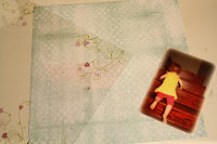
    I have had this page in my head for months. I knew that I had an awesome rub-on that I wanted to use for a 'mastering the stairs' layout (and truth be told, I took this picture specifically with this page in mind!!) This page is super simple to do: it's all in the transparency!! I love using them to add so much depth, detail and interest by simply laying it on your page!! Let me walk you through it.

    Main materials:


    I used walnut ink to change the coloring of my measuring tape ribbon

    I inked the edges of my cardstock and adhered my photo and ribbon using Glue Dots.


    The rub-on that I intended for this project talks about having courage and 'the little engine that could'. It was a bit lengthy for the space that I had to use, so I only used the first part of it.
    I love how easily this transferred to the transparency!

    I switched to using chipboard lettering when I deviated from the original 'climb the hill' text of the rub-on. This image shows the back side of the transparency page. The chipboard letters were also adhered with Glue Dots

    The last element I created was the brads to the button as an alternative to threading (and I think we all know how I feel about un-threaded buttons on layouts!!)


    Finishing touches from K&Company's Poppy Seed line include the bird and the dimensional flower


    Et Viola!
    Your turn!! I'd love to see what you can do with a transparency!!


    8.07.2011

    August Crop

    Plenty of food!!
    Lineup of Ladies
    This was Melinda's first go at scrapbooking. She did a great job!!!
    Jennifer with her Silhouette
    I have the great fortune of hosing a quarterly crop here in my hometown, and yesterday was the August Crop! We had 21 fabulous ladies in attendance and everyone had a great time!!
    Busy!