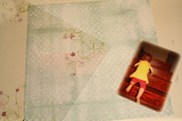
Main materials:
- 12x12 background cardstock
- 12x12 transparency
- 4x6 picture

I used walnut ink to change the coloring of my measuring tape ribbon
I inked the edges of my cardstock and adhered my photo and ribbon using Glue Dots.

The rub-on that I intended for this project talks about having courage and 'the little engine that could'. It was a bit lengthy for the space that I had to use, so I only used the first part of it.
I love how easily this transferred to the transparency!
 I switched to using chipboard lettering when I deviated from the original 'climb the hill' text of the rub-on. This image shows the back side of the transparency page. The chipboard letters were also adhered with Glue Dots:
  The last element I created was the brads to the button as an alternative to threading (and I think we all know how I feel about un-threaded buttons on layouts!!)
Finishing touches from K&Company's Poppy Seed line include the bird and the dimensional flower
Et Viola!
Your turn!! I'd love to see what you can do with a transparency!!


No comments:
Post a Comment